Home / Graphic Design / Avelor
GRAPHIC DESIGN · BRANDING

Avelor — Brand Identity System

A refined visual identity created to communicate balance, sophistication, and modern living across every brand touchpoint.
ProjectAvelor
IndustryLifestyle · Premium Consumer Brand
ServiceBrand Identity
FocusBrand Guidelines · Logo System · Typography · Color System · Visual Identity
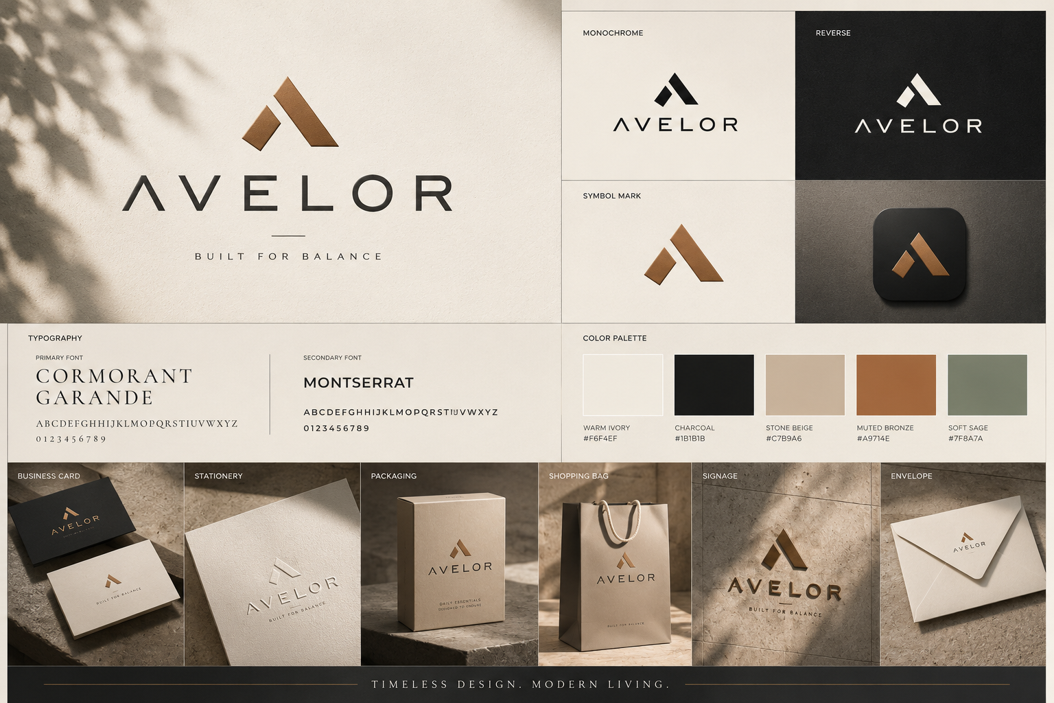
Avelor brand identity design system featuring logo, typography, color palette, stationery, packaging, and signage.
01 · OVERVIEW

Brand Overview.

Avelor is positioned as a refined lifestyle brand built around balance, simplicity, and considered design. The identity brings together a geometric mark, editorial typography, warm neutrals, and understated applications to create a consistent premium presence.

Balancea calm relationship between symbol, type, space, and material.
Timelessnessa restrained identity designed to remain relevant beyond a single trend.
Premium simplicityquality communicated through proportion, typography, and detail.
Consistencyone visual language carried across stationery, packaging, signage, and digital touchpoints.
02 · BRAND GUIDELINES

Brand Guidelines.

The Avelor identity is governed by a small set of principles that keep every brand touchpoint recognizably part of the same system.

Logo usageretain the supplied wordmark and symbol proportions without alteration.
Typographypair an editorial display voice with a clean supporting sans-serif system.
Coloruse warm ivory, charcoal, beige, bronze, and sage as the core visual language.
Layoutgive the identity generous space and clear hierarchy.
Applicationsextend the same rules across stationery, packaging, bags, signage, and digital surfaces.
Logo usageKeep the primary wordmark and symbol visually consistent across brand touchpoints.
Symbol usageUse the geometric mark as a distinctive identity element without altering its proportions.
TypographyPair an editorial display voice with a clean supporting sans-serif system.
ColorUse warm ivory, charcoal, beige, bronze, and sage to maintain a restrained premium tone.
LayoutGive the identity generous space and clear hierarchy across applications.
ApplicationsExtend the same visual language across stationery, packaging, bags, signage, and digital surfaces.
03 · COLOR

Color Palette.

The palette combines warm neutrals with muted earthy accents to create a premium, calm, and timeless visual identity. These values describe the project presentation and do not alter the source artwork.

Warm Ivory#F6F4EF
Charcoal#1B1B1B
Stone Beige#C7B9A6
Muted Bronze#A9714E
Soft Sage#7F8A7A
04 · TYPOGRAPHY

Brand Typeface.

Avelor pairs an editorial serif with a practical sans-serif to create contrast between premium brand expression and everyday information.

Cormorant Garamondprimary display typeface for expressive headlines and premium editorial moments.
Montserratsupporting typeface for utility, labels, navigation, and readable information.
Hierarchylarge display type establishes character while compact supporting type keeps applications clear.
Primary Typeface
Cormorant Garamond
Aa Bb Cc — Refined living.
Secondary Typeface
Montserrat
ABCDEFGHIJKLMNOPQRSTUVWXYZ — 0123456789
Editorial Sample
Avelor
BUILT FOR BALANCE
Supporting UI
Montserrat
BRAND · IDENTITY · APPLICATIONS
05 · LOGO

Brand Logo.

The Avelor logo combines a distinctive geometric symbol with a refined wordmark. The relationship is designed to feel balanced, stable, and recognizable across both premium applications and smaller brand placements.

Primary lockupuse the supplied symbol and wordmark together where full brand recognition is required.
Symbolthe geometric mark can act as a compact recognition element when the full wordmark is not required.
Wordmarkpreserve the supplied proportions and spacing rather than redrawing or reinterpreting the identity.
Avelor — Brand Identity supplied artwork showing the existing logo and identity presentation.
Avelor brand identity design system featuring logo, typography, color palette, stationery, packaging, and signage.
06 · CONSTRUCTION

Logo with Grid.

The logo construction is based on controlled geometry, proportion, and alignment. No unsupported measurements are introduced; the supplied artwork remains the source of truth.

Geometric constructionthe symbol is formed from simple angular relationships.
Proportionpreserve the original balance between symbol and wordmark.
Alignmentkeep the lockup consistently aligned within the surrounding layout.
Clear spaceprotect the identity with sufficient breathing room from nearby content.
01 · Geometric constructionA distinctive symbol built from simple angular forms.
02 · ProportionMaintain the original visual balance of the supplied mark.
03 · AlignmentKeep symbol and wordmark relationships consistent.
04 · Clear spacePreserve breathing room around the identity in applications.
07 · VISUAL SYSTEM

Built for every touchpoint.

Avelor extends beyond the logo into a complete visual language. The supplied identity board demonstrates how the system travels across physical and brand-facing touchpoints without losing its restrained character.

Stationeryconsistent typography, spacing, and mark placement create a coherent everyday identity.
Packagingwarm materials and controlled branding reinforce the premium positioning.
Bags & signagethe identity remains recognizable when reduced to simple, high-impact applications.
Digital surfacesthe same hierarchy and restrained palette can translate into digital brand communication.
Avelor brand identity design system featuring logo, typography, color palette, stationery, packaging, and signage.
THE WORK

Designed for balance.

Avelor brand identity design system featuring logo, typography, color palette, stationery, packaging, and signage.
READY WHEN YOU ARE

Let's make something
worth remembering.

Tell us what you're building, what you're trying to solve, and where you want to go.

Start a Graphic Design Project