
Clear hierarchy
Make the product range and promotional message easy to understand at a glance.
A premium home-appliances shopping experience focused on clear hierarchy, product discovery, and a simple path from browsing to action.
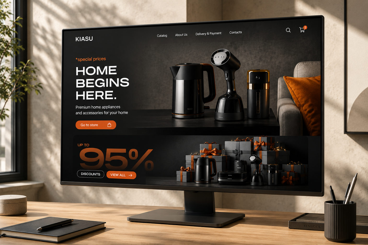
The experience is organized around the primary shopping tasks: discover products, understand the offer, compare options, and move confidently toward purchase.
A consistent 12-column desktop grid keeps navigation, hero messaging, product imagery, promotional content, and calls to action aligned. The system collapses naturally for tablet and mobile layouts.
Inter creates a modern, highly legible foundation. Large weights establish hierarchy while medium and regular weights keep product and interface information easy to scan.
The visual system combines a dark premium foundation with white content surfaces and a warm orange accent for promotional moments and primary actions.
Make the product range and promotional message easy to understand at a glance.
Use contrast, imagery, and restrained UI patterns to support a premium product perception.
Keep important shopping destinations visible and reduce friction between categories and products.
Give users clear next steps around offers, product exploration, and the shopping journey.
Tell us what you're building, what you're trying to solve, and where you want to go.
Start a UI/UX Project ↗