Home / Graphic Design / Orvia
GRAPHIC DESIGN · CAMPAIGN

Orvia — Campaign Visual Identity

A premium campaign visual designed to combine product presence, movement, and a confident seasonal brand expression.
ProjectOrvia
IndustryLifestyle · Travel
ServiceCampaign Design
FocusCampaign Art Direction · Typography · Product Presentation · Visual Composition
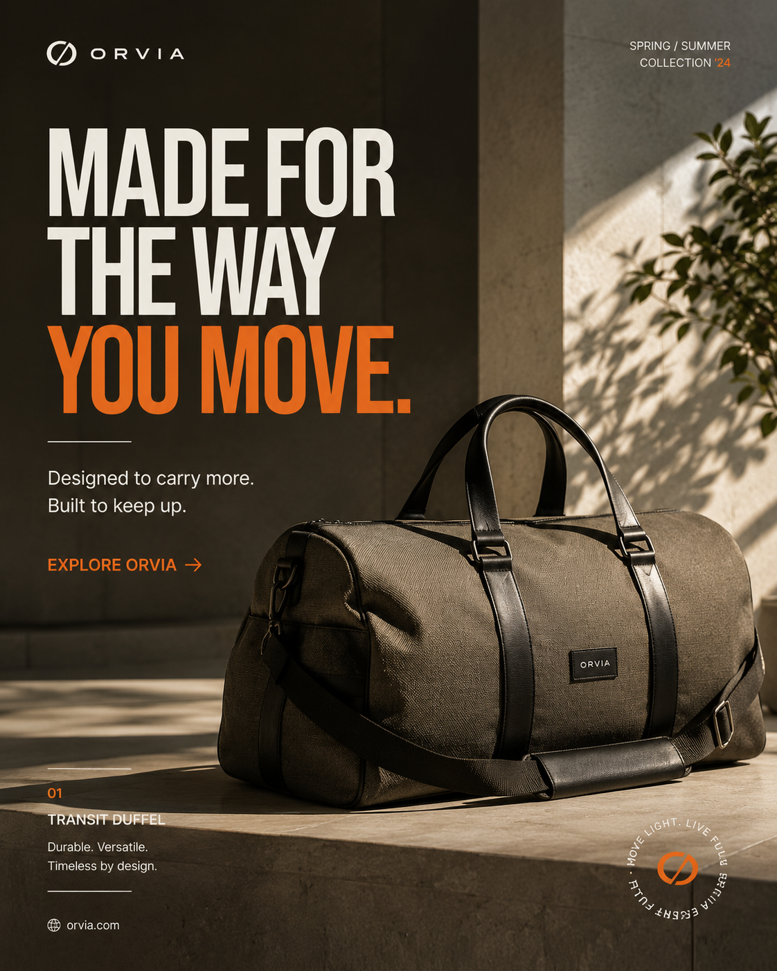
Orvia campaign visual featuring a premium travel duffel product and Spring Summer campaign typography.
01 · OVERVIEW

Brand Overview.

Orvia is presented as a contemporary lifestyle brand with a strong emphasis on movement, durability, and refined everyday design. The campaign system combines product-led imagery, bold editorial typography, warm neutrals, and a controlled orange accent.

Movementdynamic product presentation gives the campaign a sense of energy.
Durabilitythe visual language supports a dependable, built-to-last product perception.
Premium positioningrestrained color and typography keep the communication sophisticated.
Confidencestrong headlines and clear composition create immediate recognition.
02 · BRAND GUIDELINES

Brand Guidelines.

The Orvia campaign system is designed to keep product, message, and brand recognition working together across different promotional formats.

Logo usagemaintain clear placement and preserve the supplied wordmark treatment.
Typographyuse bold editorial headlines for immediate campaign recognition.
Colorcombine deep neutrals and warm surfaces with a controlled orange accent.
Image directionprioritize tactile product photography with natural light, depth, and lifestyle context.
Compositionbalance large-scale messaging with product presence and generous negative space.
CTA treatmentkeep the action clear and direct without competing with the main campaign message.
Logo usageKeep the Orvia wordmark clear and consistently positioned within campaign compositions.
TypographyUse bold editorial headlines to establish immediate campaign recognition.
ColorUse the warm neutral environment and orange accent visible in the supplied campaign artwork.
Image directionPrioritize tactile product photography with natural light, depth, and lifestyle context.
Campaign compositionBalance large-scale messaging with strong product presence and generous negative space.
CTA treatmentKeep the campaign action clear, direct, and visually subordinate to the main message.
03 · COLOR

Color Palette.

The Orvia palette balances deep neutrals with warm natural surfaces and a controlled orange accent, creating a premium yet energetic campaign language. The swatches represent the visual direction visible in the supplied artwork.

CharcoalVisual reference
Warm CreamVisual reference
Stone TaupeVisual reference
Campaign OrangeVisual reference
Soft GreenVisual reference
04 · TYPOGRAPHY

Brand Typeface.

Orvia uses bold editorial typography to establish campaign recognition, supported by clean utility type for product information, labels, and calls to action.

Display directionbold editorial sans-serif treatment for campaign headlines.
Supporting typographyclean sans-serif treatment for descriptions and utility information.
Campaign labelscompact uppercase metadata creates structure without competing with the headline.
CTA treatmentconcise action language provides a clear next step.
Display direction
Bold editorial sans-serif
MADE FOR THE WAY YOU MOVE.
Supporting typography
Clean sans-serif
Designed to carry more. Built to keep up.
Campaign label
Uppercase metadata
SPRING / SUMMER COLLECTION
CTA treatment
Strong action text
EXPLORE ORVIA →
05 · LOGO

Brand Logo.

The Orvia identity uses a distinctive circular symbol paired with a clean wordmark. The mark is designed to remain recognizable within campaign compositions while supporting the product-led visual system.

Primary lockuppreserve the supplied relationship between symbol and wordmark.
Placementposition the identity consistently so it remains visible without competing with the product.
Scalemaintain sufficient clear space whenever the logo appears alongside large campaign typography.
Orvia — Campaign Visual supplied artwork showing the existing logo and identity presentation.
Orvia campaign visual featuring a premium travel duffel product and Spring Summer campaign typography.
06 · CONSTRUCTION

Logo with Grid.

The Orvia logo construction relies on proportion, alignment, and clear space rather than decorative complexity. The supplied artwork is the source of truth for the identity.

Proportionkeep the supplied wordmark and symbol relationship intact.
Alignmentuse consistent placement within campaign layouts.
Clear spaceseparate the identity from headlines and product imagery.
Consistencyrepeat the same logo treatment across campaign outputs.
01 · ProportionKeep the supplied wordmark proportionally intact.
02 · AlignmentUse consistent placement within campaign layouts.
03 · Clear spaceMaintain visual separation from headlines and imagery.
04 · ConsistencyRepeat the same logo treatment across campaign outputs.
07 · VISUAL SYSTEM

Designed to move.

The campaign system brings together product-led composition, a strong headline hierarchy, a warm environment, and a clear action to create a confident seasonal statement.

Hero campaignslead with product and a concise high-impact message.
Product promotionlet the product remain the visual anchor while supporting it with restrained information.
Editorial layoutsuse large type and negative space to create a premium campaign rhythm.
Digital advertisingpreserve the same hierarchy so the visual remains recognizable at smaller sizes.
Orvia campaign visual featuring a premium travel duffel product and Spring Summer campaign typography.
THE WORK

Made for the way you move.

Orvia campaign visual featuring a premium travel duffel product and Spring Summer campaign typography.
READY WHEN YOU ARE

Let's make something
worth remembering.

Tell us what you're building, what you're trying to solve, and where you want to go.

Start a Graphic Design Project